
Henrik Voss, Senior Health and Science Editor.
There is a drawer in most bathrooms that nobody wants to open in front of a friend: the eyeshadow drawer. Half a dozen palettes, most used twice, one crumbling at the edges, one still wrapped in its cellophane from a Christmas that has since had a birthday. The question that eventually gets typed into a search bar at eleven at night is usually some version of why does my eyeshadow crease by lunchtime or why did this look nothing like the swatch on the lid.
The honest answer has less to do with luck and more to do with what a palette is actually made of, and how it behaves once body heat, oil and blinking get involved. A cosmetic chemist looking at a new palette does not start with the colour story. She starts by pressing a finger into the pan. That single gesture, done properly, tells a buyer more than any influencer swatch video. This piece walks through what that finger press, and the checks that follow it, are actually looking for, so the next palette bought is one that survives past March.
- Swatch on the inside of the wrist, never the back of the hand: skin there is closer in oil and temperature to the eyelid, and it shows how a shade will actually wear rather than how it looks on a flat, dry surface.
- Fallout is a formulation issue, not bad technique: loosely milled powder and a light binder will shed on almost anyone’s face, whatever brush is used.
- A palette of six well-chosen shades usually outlasts one of twenty: pigment concentration and pan depth cost money, and a brand spreads that cost thinner across more pans.
Reading The Pan Before You Buy

Before colour, texture. A specialist runs a finger across the surface of the pan and looks at what comes away. Powder that lifts in a fine, even film and leaves a visible smear on the finger has enough pigment to register on skin. Powder that barely marks the finger, or that only shows colour after several passes, has been milled with more filler than pigment.
This matters because filler, usually talc or mica used purely as bulk, is not the villain some articles make it out to be. Almost every pressed powder needs some. The issue is proportion. A high-pigment formula still needs filler to bind and press properly, but the ratio tips towards colour first. A cheap formula tips the other way, and the buyer pays for volume rather than payoff.
A simple check works in almost any shop with testers out, at Douglas, Notino or a Sephora counter: press, don’t swipe, a clean finger into the pan, then look at the mark left behind under the shop’s overhead lighting, which is usually closer to daylight than most bathrooms. If the colour looks pale and dusty rather than saturated, expect to need three layers at home to get the shade shown on the lid.
Why Fallout Happens, And How To Check For It Before You Buy
Fallout, the fine dust that drifts down onto the cheek after blending, is not simply a matter of a clumsy hand. It is largely a function of particle size and binder strength. Pigment milled into very fine particles catches light beautifully, which is why so many shimmer shades are ground fine, but fine particles are also lighter and more likely to become airborne when a brush disturbs them.
The binder, usually a blend of oils and waxes pressed together with the pigment, is what should hold those fine particles in place once the powder is on the lid. A well-bound shimmer will still shed a little, that is normal, but a poorly bound one will shower down every time a brush touches it.
A useful in-shop test: tap the pan lightly over a piece of white tissue or the back of a clean testing card, rather than over the hand. Visible loose powder settling on the tissue after one tap is a fair warning of what will land on the cheek during application. Cosmetics Europe’s general guidance on eye-area products notes that loose particulate from powder cosmetics is one of the more common sources of eye irritation reported by users, which is one reason fallout is worth checking for reasons beyond the aesthetic.
Blendability: The Flour And Butter Test
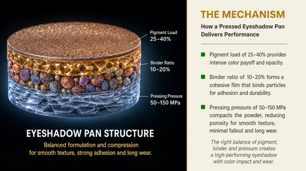
Blendability is the quality most palettes are praised for and least often defined. In practice it means how evenly a shade transitions into the one beside it without leaving a hard line or patchy build-up.
Think of pastry. Flour on its own, worked with a finger, stays gritty and separate. Add enough fat and it comes together into something that can be pressed and smoothed without tearing. Eyeshadow works on a similar principle: pigment is the flour, the oil and wax binder is the fat. Too little binder and the powder stays dry and crumbly under a brush, resisting a soft edge. Too much and the shade becomes patchy and slips, migrating into the crease within hours.
The test for this is done with a finger or a fluffy brush directly on the pan, blending two adjacent shades together on the back of a clean testing card. A well-formulated pair will feather into a soft gradient within two or three strokes. A poorly bound pair will either resist blending altogether, staying as two distinct blocks of colour, or will smear into a muddy, uneven patch. Neither extreme is fixable with a better brush at home, whatever the packaging suggests.
Matte, Shimmer And Metallic: What The Finish Actually Changes
The three finishes are not simply cosmetic choices, they are different formulas with different trade-offs.
Matte shades rely almost entirely on pigment and filler, with very little reflective material, which is why they show every inconsistency in application honestly. A poor matte looks patchy immediately, because there is no shimmer to soften the eye’s read of the surface.
Shimmer shades add finely milled mica or synthetic pearl to reflect light. This is genuinely more technical to formulate well, because the mica particles need to sit at a consistent angle within the pressed powder to reflect evenly, otherwise the finish looks gritty rather than luminous.
Metallic finishes push this further, often using larger, flatter pigment particles or a cream-to-powder hybrid base to achieve a wet-look sheen. These formulas are the most prone to fallout, because the larger particles that create the metallic effect are also the heaviest and least easily held by the binder.
None of the three finishes is inherently better made than another. The point worth knowing before buying is that a matte and a metallic in the same palette were very likely engineered to different standards, because they need to be, and comparing their wear against each other is not a fair test of the brand’s overall quality.
Colour Stories That Photograph Well But Wear Poorly
Many palettes are built around a colour story designed for a swatch photograph on a phone screen rather than for six hours on an eyelid. A palette can look extraordinary arranged in a gradient for social media and still contain three shades that are nearly identical once applied and blended, because photography flattens subtle undertone differences that the eye picks up instantly in daylight.
British Vogue and Harper’s Bazaar beauty desks have both noted, in seasonal round-ups over recent years, that palettes built for editorial photography often prioritise a striking top-down shot of the pans over a wearable transition on skin. That is not dishonest, it simply reflects a different purpose, but it is worth the buyer knowing.
A fair way to judge a palette’s real colour range is to swatch three shades side by side in a single sweep on the wrist, in daylight rather than shop lighting, and check whether each one earns its place. If two shades read as the same mid-brown once blended, the palette effectively offers fewer usable looks than its pan count suggests.
Testing On Your Own Skin, Not The Back Of Your Hand
The back of the hand is where most people swatch, largely because it is convenient and roughly matches skin tone. It is also, for testing purposes, close to useless. The skin on the hand is thicker, drier and less oily than the eyelid, and it does not move the way an eyelid does when blinking.
The inside of the wrist is a closer match in oil production and temperature, and it creases when the wrist bends, which gives a rough preview of how a shade behaves under repeated movement. Some shops now offer disposable applicators specifically for testing on the eyelid itself, which is the only truly accurate test, though understandably not always practical mid-shop.
A reasonable compromise: swatch on the wrist, wait roughly twenty minutes while doing the rest of the shopping, then check whether the colour has oxidised, meaning shifted warmer or darker, which some formulas do once they interact with skin oils over time. A shade that looks cool grey on first swatch but reads warm taupe twenty minutes later will behave the same way on the eye by early afternoon.
Packaging Details That Matter More Than They Look
Packaging is often dismissed as marketing, and much of it is, but two details genuinely affect day-to-day use. The first is pan depth. A shallow pan, however beautifully pressed, holds less product and will hit the metal base sooner, at which point application becomes patchy regardless of the formula’s quality. Palettes with deeper pans, checked simply by looking at the pan’s edge against the casing, last measurably longer at the same rate of use.
The second is the mirror and hinge. A mirror large enough to see the full eye area, and a hinge that holds the lid open at a workable angle without the palette sliding shut mid-application, are not luxuries. Anyone applying eyeshadow on a train, or in the ten minutes before a nine o’clock meeting, notices the difference immediately.
A magnetic closure that clicks shut firmly is also worth checking in shop, since a loose closure is how a palette ends up open at the bottom of a handbag, with three shades merged into one by September.
Reading The Ingredient List Without A Chemistry Degree
The ingredient list on the back of a palette follows a fixed order by concentration under EU cosmetics regulation, so the first few entries carry the most weight. Talc, mica and dimethicone appearing early are entirely normal and not a red flag on their own, they are structural and textural ingredients present in most pressed powders on the market.
What is worth a closer look, particularly for anyone with reactive or sensitive eyes, is the preservative system further down the list, since the eye area is more prone to irritation than most of the face. The European Academy of Dermatology and Venereology has published general guidance noting that fragrance and certain preservative classes are among the more frequently reported triggers for eyelid dermatitis, which is one reason fragrance-free formulas are worth seeking out for anyone with a history of eye irritation, rather than assuming any pressed powder is automatically safe simply because it sits unused for months at a time.
A short list is not automatically a better one. Some perfectly good, well-tolerated palettes carry longer ingredient lists than cheaper competitors, because the additional entries are stabilisers and antioxidants that extend the product’s usable life once opened.
Key Takeaways
A palette worth its price shows its pigment on a pressed finger, not just on the box. Fallout is a formulation trait, not a personal failing with a brush. Matte, shimmer and metallic shades within the same palette are built to different standards and should not be judged against one another. Colour stories designed for photographs do not always translate into distinct, wearable shades on the eye. Testing on the wrist, and waiting a few minutes to see whether a shade oxidises, tells a buyer far more than a swatch on the hand. Pan depth and hinge quality decide how long a palette lasts in daily use, quite separately from the formula inside it. And a longer ingredient list is not automatically a warning sign, it can simply mean a more stable formula.
A Quick Checklist For The Counter
- Press a clean finger into the pan and check how much colour transfers.
- Tap the pan gently over tissue and look for loose powder before it lands on the cheek.
- Blend two adjacent shades on the back of a testing card, not just swatch them separately.
- Swatch on the inside of the wrist, in daylight, and wait twenty minutes to check for colour shift.
- Check the pan depth against the casing rather than assuming size reflects fill.
- Open and close the hinge and mirror once before buying, not after.
This article is general information and does not replace professional dermatological or cosmetic advice.
Individual skin reactions and results vary from person to person.